Wk15 – Art Experience – Finger Painting

img_1701

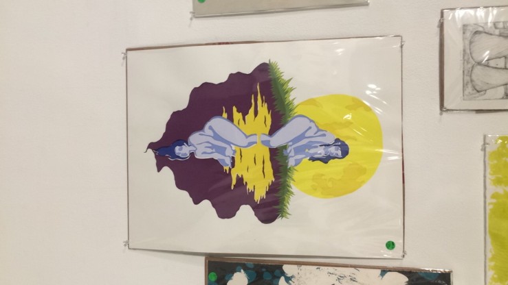
Our final activity! For Week 15, finger painting was the final art experience. I will be honest, some of these activities were very fun and I will miss taking this class next semester. I even ended up enjoying drawing Batman every week for my ID card.

The finger painting was pretty quick in execution, but very fun and reminded me of kindergarten. It was actually very relaxing, especially right now, the weekend before finals week. The paint slowly dried around my fingers, creating a brittle crust that was slightly difficult to wash off later on. It reminded me of the single sink that existed in a classroom where I would run a daycare for PTA meetings. The sink always smelled like washable paint, even when nothing resembling paint had touched it in days. Being a college student, finger painting is not a normal activity, and it brought me back to a time when things were much simpler. It was actually harder than I thought it would be, as the paint didn’t slide off of my hands so easily. Adding to the difficulty of this, abstract format made it harder to begin. Eventually, just by pressing my hand onto the board, small movement turned into larger ones which ended up being really fun. Compared to the graffiti activity, this feels like it comes with a whole other set of connotations. They’re both expressions through paint, although graffiti seems more mature than finger painting, even though finger painting was probably one of the first art forms to ever be invented. I’ll certainly be keeping this painting.

Wk15 – Artist Conversation – Katherine Maleki

img_1698

Artist: Katherine Maleki

Exhibit: Moonpool

Media: Painting

Gallery: Marilyn Werby Gallery

Katherine Maleki is a sophomore working towards her BFA degree in Graphic Design from the CSULB School of Art. Her passion revolves around Printmaking, and she may be adjusting her major accordingly. She decided to pursue an art degree after encouragement from her parents. Katherine has already designed posters for companies, and will probably continue to do so for the foreseeable future.

Moonpool emphasizes the female figure in the reflection of a moonlit lake. A woman painted in blue cautiously dips her leg into the placid lake, while the rest of her body sits on a grassy ledge. In the lake’s reflection, a mirror-image of the woman hangs upside-down with her hair hanging in the water. The water is painted purple and creates a calming effect, almost as if the scene is somewhat melancholy. Katherine has stated that the painting can be hung up either way, although she painted it with the moon upwards. I displayed the photo horizontally to represent both versions of the experience. The brush strokes resemble Native American folk art, giving off the form of the image without many details, left to the imagination.

Katherine Maleki said that the idea for this piece came out of nowhere, without actual real world inspiration. It focused mainly on the shape and color of the images, as well as the female figure itself. The mirrored women have to do with repeating elements. The use of two women along one line gives the painting a symmetrical pattern, allowing it to be hung up in any direction. Maleki said that the female figure is very important to her and a prominent element of her work. The use of women in art is timeless, and when used next to nature it creates a very beautiful image.

I liked Moonpool because of its resemblance to Native American folk art. The female figure resting on the grass by a lake is very natural, giving it a special authenticity. I also like how the piece is able to be flipped in multiple directions, making it very versatile. The simplicity of the piece makes it into a perfect home decoration.


Wk14 – Art Experience – Instagram

img_1685img_1684img_1683img_1682

I picked these four images from our 2016 art hashtag because they all stood out to me in some way, compared to the other photos. For the most part, the class photos were pretty similar: food, campus scenery, selfies. It seems like we are all in a similar environment, but still disconnected. Social media updates us and informs us of the things that happen in the world, and what our friends are doing with their lives. But, it doesn’t create an incentive to actually interact with anyone, just to observe. It almost acts like a filler for real life, to be experienced through seeing instead of having to do it yourself. The first photo is mine, and it’s special because my board represents a freedom from daily routine. Skating around frees your mind from all of the daily tasks that linger within, allowing brief relief in the easiest of ways. The pizza pic reminded me of a shop in Berkeley, where I would get my favorite pizza with my dad. It was awesome because I was young and he would show me the great big world that existed past what I could find out myself. The hummingbird is simply a beautiful visual, and probably the best within the entire Instagram class collection. I thought the chalk board list of Brexit, Trump, and No Potluck was funny because it was so out of the ordinary and silly, to juxtapose those three things together like the potluck was the final great letdown of 2016. It also made me feel a little better about the election to hear a non-cynical joke that was light-hearted. I am happy that this project was saved for the end of the semester, because it was very enlightening.

Wk14 – Classmate Conversation – RJ Cayabyab

img_1688

RJ (Rei) Cayabyab introduced himself to me in class on Wednesday, saying that we already had a class with each other last semester. Apparently, we had a general education communications class together in the spring of 2016. He remembered our activity instructor’s name even though I forgot it, although I could recall his distinct ponytail. RJ is an accounting major, and he asked me several questions about economics (my major) since he’s currently taking a course in macroecon. Lots of people struggle with economics from my experience, comparing it to a science that takes certain conceptualizing skills. I think it comes somewhat naturally to me, and I think the topic is interesting. RJ likes to play basketball, and does so occasionally at the rec center. He told me about an intramural tournament in which his team played against countless intramural veterans, getting beat every time. That does not sound like any fun, which is probably why he doesn’t do it anymore. I enjoyed talking to RJ during class, but in the days after he didn’t send me our classmate conversation photo, which is very annoying.

Wk13 – Classmate Conversation – Samuel De La Cruz

img_1648

Samuel De La Cruz is working towards his BS degree in Chemistry, a very difficult task for anyone to achieve. Obviously, he’s incredibly smart in order to be pursuing a science degree. We talked about art for a while, and Sam believed that art is subjective to the viewer, meaning that there is no definitive explanation for any specific piece. I agree, and I don’t believe that there is an “actual” feeling which is supposed to be experienced. This is more pronounced in movie “symbolism”, and it ruins the cinematic experience to analyze what makes the movie special. If you take a painting and divide it into 12 equal parts, examining each piece, it takes away from the overall beauty. Concerning the question of the week, we both agreed that the red pill is definitely the better option. While the “ignorance is bliss” argument is valid in defense of the blue pill, once a small portion of curiosity forms, that reasoning no longer applies.

Wk12 – Artist Conversation – Sage Garver

Artist: Sage Garver

Exhibition: BIO

Media: Metal, Sculpture, Plaster, Installation

Gallery: Dennis W. Dutzi Gallery

img_1642

Sage Garver is currently earning her BFA degree from the CSULB School of Art’s Sculpture Program. This exhibition is part of her degree program, as well as an expression of a very personal struggle that she decided to share. The title BIO is fitting, representing a connection to both the theme of the exhibition and artist which will be discussed later on.

In the middle of the room, a golden chain link hangs from the ceiling in various patterns. The thin golden chains create a dreamcatcher-like visual that works well in contrast to the white patterned walls. The centerpiece appears to be the wall itself, but the chain links add substance to the middle of the room. Also within the center of the room, a metallic structure that resembles the artificial heart of the exhibition. On the walls, protruding structures exist that remind me of seaweed and bubbles. These comparisons don’t reflect the theme exactly, but they do match a biological factor within the health of any individual, plant or animal.

Sage Garver has stated that this project has to do with personal health and body illnesses, including her struggles to cope with everyday life. These include specific food restrictions, as well as a loss of independence from certain bodily controls. The patterns on the walls are representative of foreign illnesses infecting the body of the individual. The solid white canvas no longer exists, and has been hijacked by a transformative substance.

The best part of this exhibition in my opinion is the meaning behind the walls. Sage is expressing a clear desire to somehow alleviate the stress that comes with physical illness. The walls are haunting in their patterns of illness, reflecting the fact that these walls and the person it represents may never be the same again. They may never achieve the outcome of glowing health that so many people take for granted, and it must be internalized for the healing process to begin. Instead of denying the existence of imperfect walls, acknowledging their faults may be the best course for recovery.


Wk11 – Artist Conversation – Nicholas Dison

Artist: Nicholas Dison

Exhibition: Synergizing Fields

Media: Ceramics, Installation

Gallery: Max L. Gatov Gallery West

Instagram: Dison_Ceramics


Nicholas Dison is currently working towards his BFA degree in the CSULB School of Art’s Ceramics program. He is a senior, and has travelled extensively throughout the world. These trips inspired him to create a collection that mirrors his experiences with other cultures, using ceramics as the medium. Ceramics is a perfect art form for this task, because pottery has been found and studied from nearly every civilization in the history of mankind. All sorts of bowls and vases are found in the ruins of Ancient Greece, Native American burial grounds, and remnants of Imperial China. The best part of these findings is the fact that they reveal so much about the culture of their creators. Nicholas replicates and elaborates on cultural ceramic patterns in his exhibit Synergizing Fields.

The pieces are very beautiful, reminding me of ceremonial, jewel-encrusted decorations from Imperial China. There are several paintings and several ceramic household items. The paintings are made with a colorful mixture of orange, yellow, red, brown, black and gold. The color scheme reminds me of very natural, earthy tones. The orange and yellow cause the paintings to feel old, like they were formed from rock and magma. Within the border of the paintings are abstract rock formations, almost like boulders swimming in pools of lava. The red and golden vase looks like it has a heavy Eastern influence, replicating Chinese or Indian design. Each piece looks like something from the past, distinct in its creation from any other era.

Nicholas Dison created his collection with the intent to create a conversation about the nature of art. Each piece is inspired by actual cultural styles, reflecting on how they were received during their respective eras. Not all techniques and styles are initially praised, especially during earlier time periods. The nature of art is to make the audience feel something, and the inspiration usually comes from the artist’s environment. Periods marked by oppression always censored art from being created freely, because art is so effective in swaying public opinion. The many cultures that inspired Synergizing Fields differed in their levels of openness, but the point of the exhibit is to contemplate why each style existed in that specific aesthetic.

I liked this exhibit because of the earthy aesthetics in the paintings. If I could have purchased some of the paintings, those would certainly be in my house right now. The orange and yellow surrounded by golden ripples inspires a sense of raw creation, like the era of the Earth when the mountains were just forming from molten lava. It’s very positive and energetic, giving immediate visual markers to the viewer.


Wk9 – Art Experience – Art Care Package

img_1626

This week, Art 110 has the class sending care packages to their friends or loved ones. We were instructed to send anything of value or meaning to our desired recipients, and I immediately thought of my parents and sister. My mother, father, and 12-year-old sister all live near San Francisco, so they haven’t had the chance to see me very often since I arrived in Long Beach for college. Also I realized that young men away from home call their parents far less often than women, making this project a great reason to reach out. It contains two pieces of art from previous weeks to let them know how my class is going. There’s a stuffed puppy from the dollar store for my sister, a pleasant surprise found in the solemn store where I buy occasional necessities. My mom’s bag and coffee mug are inside too, from when she helped me move into my apartment in August. The ramen is there to show my parents what a college diet must sometimes resort to, although I haven’t gotten tired of it yet.

Other forms of communication are great for quick notes and conversations, but they always feel less genuine than mailed letters or packages. Snapchat is super fun and efficient, but it requires zero effort and the receiver knows it. The care package obviously takes noticeable effort. I will be packaging it, driving to the post office, getting the correct shipping labels, paying a small shipping fee, and finally going back home. This extra effort will receive a far better response than if I sent a thread of emojis with the same items. The tangibility of care package items provide a physical viewing effect not possible from a phone screen.

Ephemera is immensely valuable in a sentimental sense. Objects that have a personal, historical significance will always be worth more than any single purchased object, to the specific owner. I bet nearly any person in a random location would choose to save their childhood family photos over their car. Things that cannot be replaced will always come first for most people.

Art that is meant for anyone has a high likelihood of being received positively, but it always has a capping point. The Mona Lisa can only inspire a certain level of feeling in a person. However, this is contrasted by small, personal art. Leonardo da Vinci probably felt a wave of emotion not possible for anyone else by seeing his creation become real. It was personal, and could have meant everything. A care package full of little trinkets will only effect several people, but in the most profound way possible. Broad audience art is like a football stadium light shining on a crowd, while personal art is a single-focus laser.

Wk9 – Artist Conversation – Vanessa Olivarez

Artist: Vanessa Olivarez

Exhibition: Don’t Be Careful, Be Gentle

Media: Acrylic, Plastic, Film

Gallery: Dennis W. Dutzi Gallery


Vanessa Olivarez is working towards her BFA degree from the CSULB School of Art’s Sculpture Program. This is a non-degree show that Vanessa was simply inspired to create due to her fascination with acrylic. It began with acrylic, and then evolved into something much deeper as she decided the theme of the gallery.

When you first walk into the gallery, it resembles a fantasy-like setting. The room is completely covered in pink lighting, which initially made me check out the gallery in the first place. The eerie lighting works well for the entire display, because without the added atmosphere it wouldn’t blend together as seamlessly. The lights create a sort of other-worldly effect, and the doorway is the one-way entrance. In the middle of the room, an acrylic seesaw tips back and forth electronically. Vanessa stated that the seesaw took two weeks to code and finish programming. In addition to movement, a creaking sound has been added to the seesaw rivaling horror movies in its ominous tone. Opposing film images on the walls show two drawn girls in front of a ring structure in pink and purple. They are the same image, but are designed in opposing colors to create a mirror effect. Lastly, a small, old-fashioned television sits on the floor surrounded by acrylic. It quickly transitions between several scenes, with the most memorable being a pair of clown dolls. This furthers the eerie horror movie vibe.

Vanessa Olivarez began this project with acrylic, thinking about how it was transparent, reflective, and could work with the theme of identities. I asked about the clowns, because they were so odd as a creative choice for a gallery. She said that they represented identity as well, since their expressions were painted and anyone could feasibly be behind the mask. She also stated that the gallery focused on “fluidity” and “balance”. The seesaw used this in its creation, literally tipping back and forth between the different versions of the little girl on the walls.

I liked this gallery because it really attempted to create an immersive atmosphere for the viewer. Instead of simply providing images for an audience to judge or make sense out of, it gave audiences something to be a part of, turning the Dutzi gallery into an entire experience. It really worked in its display, since the fantasy-like horror theme was felt as soon as you walked past the blinders. I wondered what kind of identity every viewer would place onto the blank face of the wall, knowing each would be different.

Wk8 – Art Activity – Sketching at the Japanese Garden


img_1613

Sketching at the CSULB Japanese Garden was a great spot to get the creative juices flowing. I thought that the nature aspect of the meeting location helped in each student’s willingness to start sketching.

img_1623

This is my primary sketch, which took about 10 or 11 minutes to complete. I actually had a great time doing this, since the Japanese Garden is genuinely relaxing. Sitting on a rock by the trail, I selected my panoramic view and started from the bottom upwards. The best part of sketches is its freedom from pinpoint accuracy or mistakes. Since the picture is by definition a “rough sketch”, I can draw quickly and boldly. The mini-railings between the concrete path and grassy edge were made very easily and quickly, but I was pleasantly surprised by how they turned out. The background took slightly more work, because through the increased distance everything looks densely packed together. The picture as a whole would be recognizable if held up next to the same real-life viewpoint.

This abstract drawing didn’t turn out well at all, and the vision in my mind would have taken much more practice to depict. The oval figure was inspired by the lake, as I imagined a hanging light over an empty table in a dark room, resembling LA noir detective cliches. I pictured a placid, night time lake in a dark void with a faint light shining over it from a distant background, and then a door opening to the side in a weird, alternate-dimension fashion. The picture to the right was my inspiration for the abstract lake setting.

img_1621

These are my initial sketches that I used as a warm up before heading to class on Wednesday. These came extremely easy to me, since I started doodling when I was 15 in chemistry class at 9 in the morning. All of the mini pictures are completely improvised, and I never know what the final doodle will be until I start drawing it. Doodling is an immediate stress-reducer, and takes minimal effort. Personally, sketching is something that I will probably begin to practice on a regular basis in between lectures, or during lectures, or whenever boredom and a lack of concentration begin to overtake my focus.